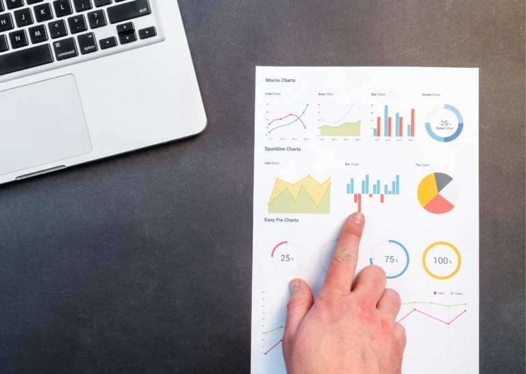
DataViz: choosing the perfect chart for your data storytelling
When thinking of DataViz or data visualization, the first thing that pops into our minds is choosing the right chart. It is not easy to...
Lire plus10 résultats trouvés
When thinking of DataViz or data visualization, the first thing that pops into our minds is choosing the right chart. It is not easy to...
Lire plus
With 80% of a market estimated at 200 billion DH, traditional and small businesses must be treated with a special kind of care by brand...
Lire plus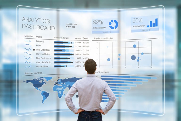
Scientists agree that visual information is processed 60,000 times faster by the brain than textual information. One could debate on the precision of this figure...
Lire plus